Some may remember an article by Matt on the subject of movie posters, well DVD covers also have a problem of a dying art.
Let’s look at the most egregious examples of ruining perfectly good DVD covers. These aren’t in any particular order and the only rule is that it has to be a new piece of art created for a new release, not just the companies using an alternative poster for the DVD.
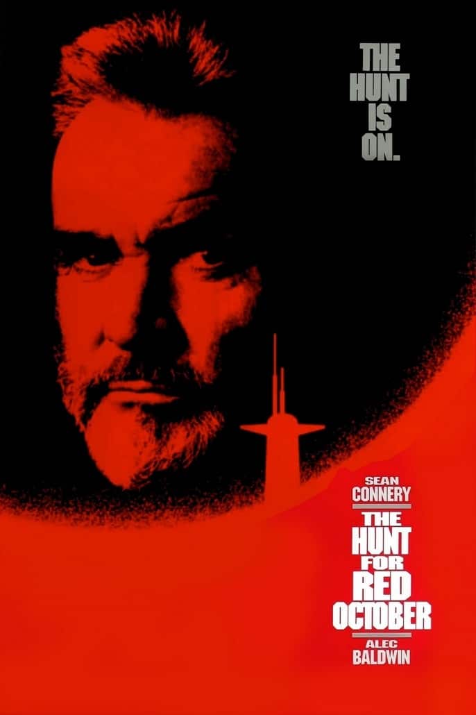
5.) The Hunt for the Red October
Based off the Tom Clancy bestseller of the same name, we have the story of a famous Russian submarine captain (Sean Connery) defying orders to steal his country’s newest and most advanced sub to defect to America. However, this is extremely risky as no one else knows his plan. The only one to figure it out is Jack Ryan who must make his government understand to not cause an international incident. The original poster for “The Hunt For the Red October” is iconic. While it’s mostly just Sean Connery’s face with the sub in the background all in red it is a very striking image. It’s hard to describe why, but it does get the mood of the film down.
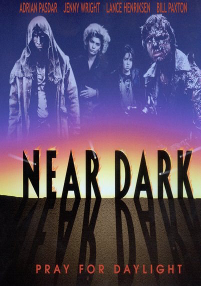
4.) Near Dark
This one is almost funny in how they try to change it into something else. Now this is a case where the original art isn’t the greatest, but they do work to try to include the famous image of Bill Paxton’s character with his head cracked open. For those who haven’t seen it “Near Dark” is about a young man who after hooking up with a woman who turns out to be a vampire, is turned into one as well and is then welcomed into the fold of a nomadic tribe of what is often referred to as cowboy vampires. This is a horror film and vampire tale, but it is firmly set in tone and aesthetics is a western. From that you can realize why this is an odd film to market, but it is a fun flick with a devoted fan base.
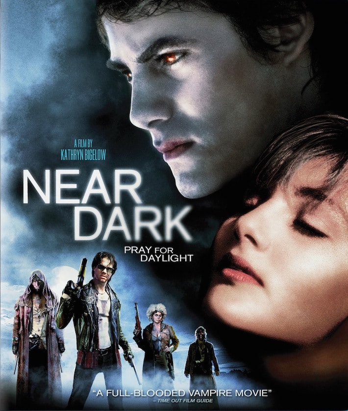
So now if you were to try and buy the film you’d probably only be able to find is this new version. Is it me or does it look like something else? Hmm what newer franchise does this color scheme and lettering does this remind you of. So yes, this is totally meant to look like a “Twilight” film; now I’ll admit something up front. I DO NOT GIVE A CRAP ABOUT “TWILIGHT.” I have not read any of the books or seen any of the films because shocker, I don’t generally go see stuff I’m not interested in. However thanks to pop culture shoving it in my face I’m aware of enough stuff to know why this is almost funny. “Near Dark” is a hard R; the bar attack scene is chilling and DARK. Needless to say some poor sap who buys this because this looks like a “Twilight” film is in for a rude awakening. Great for a prank, but not so much for what the art on the box is supposed to do which is give you some idea of what kind of story you’re about to watch. And needless to say lying to your audience doesn’t quite fall in line with that.
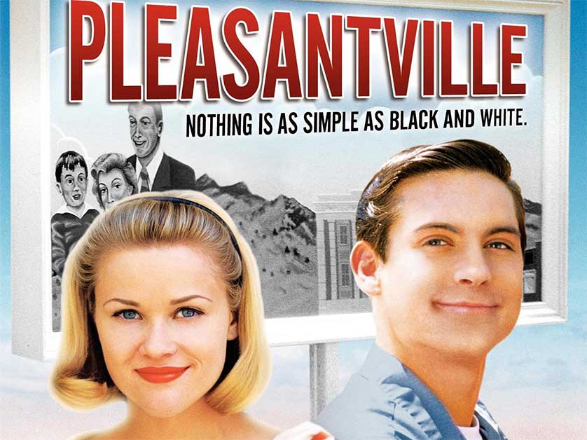
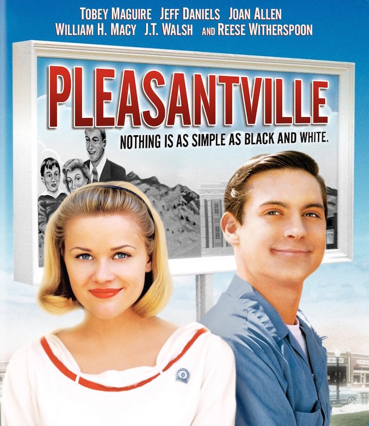
3.) Pleasantville
“Pleasantville” is one of my favorites, but it is a strange film in that the premise was old when the film was new. I can’t tell you how many TV shows I had already seen in elementary school that already had done the characters in the real world get sucked into a TV world. Like I’m shocked this wasn’t immediately laughed out of the studio office. However, there is one thing the film does very well which is take that simple done to death premise but really follow through with the concept. It’s not just as simple as the kids having to survive the show, they completely change it by their existence. The story even has a lot to say about the time period’s social changes that it satirizes. I really can’t say enough why I like the film so much. Now this is a case similar to “Near Dark” where the DVD cover is not exactly great, I myself am more of a fan of the original posters as they’re much more striking of images. However, the original DVD cover art does get the idea across.
However the new cover is awful, and particularly awful in that way of just show medium close-up shots of the famous actors. This is a common trend in posters that is just terrible. They never tell you what a film is about, they just tell you who is in it which should not be the primary focus of the poster. Also looking at the newer cover would you be able to tell what the premise is from the cover? It’s just two people in front of a black and white billboard, sure because I’ve seen the film already I know how it relates to each other but a random person looking for something to watch is going to have no idea and probably no reason to even pick up the DVD to turn it around to read the back. I mean would you, unless you’re a fan of the actors.
Click to see the last 2 entries
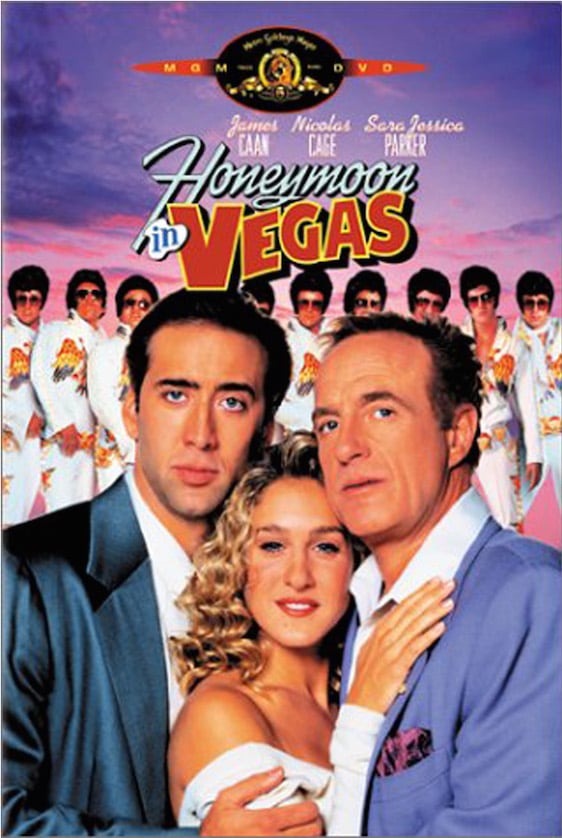
2.) Honeymoon in Vegas
Another favorite of mine both with the film itself and with Nic Cage’s performance. The story is about a man (Cage) deeply afraid of commitment (thanks to his mom’s death) and finally nuts up and proposes to his long time girlfriend (Sarah Jessica Parker) to get married in Vegas. Upon their arrival a gangster (James Cann) catches a glimpse of the girlfriend who is the spitting image of his beloved ex-wife and decides he wants her. He invites Cage to a friendly game of poker and ends up getting him massively in debt to him. Cann then offers to wipe out his debt if he’ll let him take his girlfriend out on a date. Surprisingly he ends up being super charming and convinces her to come with him to Hawaii. So Cage must show what he’s made of to win her back. Written by the same writer of the script that eventually became “Blazing Saddles” this is a really funny movie and an amazingly talented cast. The original poster is eye-catching with the 3 main actors towering over the Vegas skyline. Again the actual DVD cover is not as good-looking, but it gets the job done.
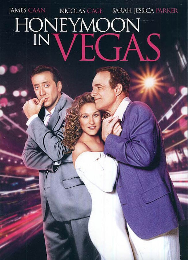
With the newer version we have another case of a DVD trying to make itself look like a totally different kind of (and more recent) film. Specifically “Sex in the City” with the colors and new font. Now I’ve never watched the show (no interest) but from my understanding it is a romantic comedy. So at least we’re firmly in the same genre, but still it’s probably going to be jarring. This wouldn’t be so bad if this was with newer special features, but really like all of the others they haven’t done anything new to the DVD’s themselves, they’re still the basic DVD just with a newer crapper looking DVD. Take a page out of “The Day the Earth Stood Still” DVD. Yes, the only reason they changed the cover was to make it look more like the then recent remake but A.) the original cover wasn’t great and kinda needed an upgrade and B.) they took the opportunity to add some great new making of’s. But now I’m starting to rant so let’s continue.
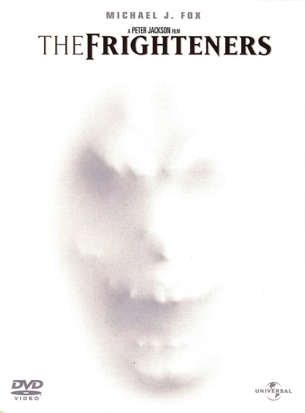
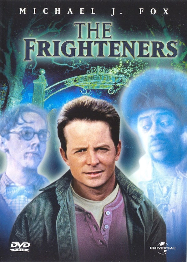
1.) The Frighteners
Peter Jackson’s “The Frighteners” is an interesting film. It was originally planned as a spin-off film of “Tales From the Crypt”, but eventually grew into its own film. In my opinion, it’s an alright film. It’s about Michael J Fox’s character who can see real ghosts, but uses that power to con people into seeing fake ghosts for money. This changes when he starts seeing a Grim Reaper who can instantly kill the living and ghosts (you figure that one out) and must uncover the backstory to save everyone while dodging one of the strangest characters Jeffery Combs has ever played which is saying something. The cover is minimalistic, but effective. I can’t fully explain why as this goes against what often makes for good box art, but boy does it draw your eye. Yes you couldn’t discern the premise from this image but admit it, this face poking through the white intrigues you doesn’t it? Sometimes that can work just as well.
“Presenting Disney’s The Frighteners lol!” That’s seriously what goes through my head whenever I look at this new cover. Which is funny not just in the wow this film is so amazingly NOT for kids despite how much this new art makes it look like it is kind of way, but since Michael J Fox’s reason for doing the film in the first place was to try and branch and be seen as someone who could be in something darker, more adult. Now yes the film does have its silly parts, for instance R Lee Ermey cameos as the ghost of a drill instructor that is SO close to his character from “Full Metal Jacket” Gunnery Sergeant Hartman that in my own personal head cannon it is the same person. However like I said earlier, this film gets dark at certain points. Also, while the CGI on the Grim Reaper is dated I have the distinct impression any kid who would watch this because their dumbass parent just looked at the cover and assumed it was a kids film would be HORRIFIED by those scenes and with good cause. Now you may say well that’s the parent’s fault for not checking the rating, not the DVD’s. And I’d be willing to agree with you if “Deadpool” hadn’t happened and proved that there are a lot of stupid parents out there. However, even ignoring all of that this is an ugly looking cover. Again the original is mysterious, a bit creepy and makes you want to know what it’s about. Despite being a Michael J Fox fan this cover would probably make me toss it back wherever I found it. I know we can’t always expect great art for every poster or DVD cover, but that’s still no excuse not to try.
View Comments (3)
I like The frighteners a lot. Really a fun film and the original cover is outstanding. The new one looks so generic.
I hear a lot of people say the Director's cut is better.
I'll have to find that.